
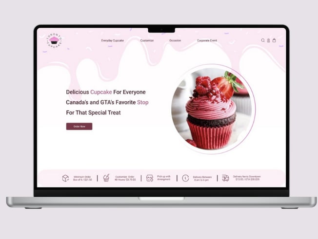
Redesign of a Cupcake Delivery Website
Toronto Cupcake
Project Overview
Toronto Cupcake, a local business in Toronto, Canada, specializes in handmade cupcakes with customizable options. However, the website is outdated and lacks important details. The complicated ordering process makes it hard for all customers to place orders, often discouraging them from using the site.


Role
Team
Duration
Tools
UI/UX design
Group of 2
12 Weeks Part Time
Figma, photoshop, Google Form, Canva, Zoom, Word

Problems


Write The main menu was hard to find, making it difficult for users to explore the website.
The website's inconsistencies negatively affected the user experience, making the website seem unreliable .
The cupcake pictures were low-quality and didn’t attract customers.
The customization options were unclear and frustrating for users, leading to a poor experience.
The checkout process was confusing and caused customers to leave without buying.
Hidden Navigation
Inconsistent Design
Low-Quality Photos
Complex Customization
Checkout Problems
Goal
Attract users by making website visually more attractive.
Provide an easier navigation.
Simplify the process of customization
Make the shopping and payment process easier by designing a user friendly website.
Design Process
Problems
Solutions
Heuristic Evaluation
Interview
Competitive Analysis
Affinity Diagram
Cart Sorting
Site Map
Persona
User Flow
Sketch
Useability & Iteration
Wire Frame
Mood Board
UI Kit
Visual Design
High Fidelity
Prototype
Useability Test and Iteration
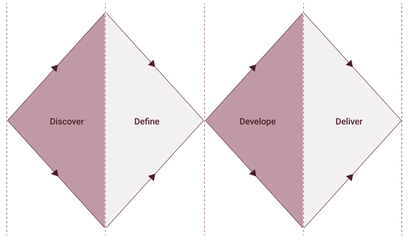
We used double Diamond method based on the Design Thinking Methodology.
Discover
Heuristic Evaluation
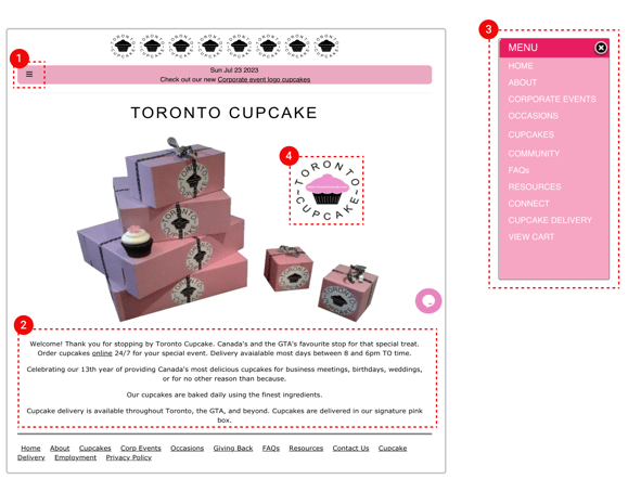
Before doing user interviews, our team performed a heuristic evaluation of the website to discover the main usability issues, and to get a better insight on what to focus on during the user research.
The website's design and content are outdated and many issues were noticed.
1. The menu bar is in the wrong position and hard to find.
2. The homepage has too much unnecessary information.
3. The navigation bar is messy, and it’s hard to find cupcakes, even though it’s a main option.
4. The logo is a CTA to order cupcakes, but users don’t realize they can interact with it.
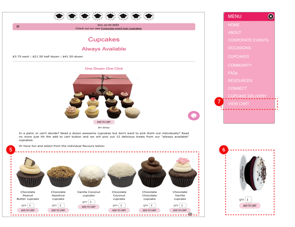
5. There is no filter or sorting option to make finding cupcakes easier.
6. There's no information about each cupcake , like ingredients , price or reviews.
The website has low-quality and careless product photos.
The website doesn't mention the best- selling cupcakes.
7. Adding a cupcake to the cart doesn’t show any feedback, confusing users about whether it was added or not.
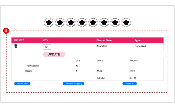
The “view cart” option is hard to find, and there’s no cart icon. Users have to open the navigation bar every time to see the cart.
8. The website frustrates users with long texts.
The photos aren't clickable, and there's no button to place orders for birthdays or weddings.
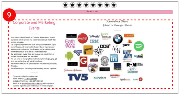
9. The ordering process is super confusing, and in the end, users have no choice but to call or send an email to place an order.
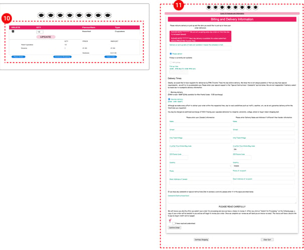
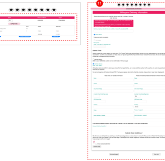
10. The “Place Order,” “Continue Shopping,” and “Clear Cart” buttons look the same, making it easy to accidentally clear the cart.
The shopping cart does not display any image of the purchased product.
